Product Designer
SILKROLL_COVER2.png

SilkRoll

Redesigning the sign-up process for SilkRoll to increase conversion

Obtaining more active users through simplifying and informing.

silkroll_title_image.png

Business overview

SilkRoll is a startup company that is focused on sustainable fashion. Their vision is to build the world’s largest shared closet. Understanding the negative environmental impact of the fashion industry and fast fashion, SilkRoll’s service is to incentivize people to trade and recycle clothes rather than buying new clothes.

SilkRoll uses a unique point system called “Qs”. An item’s Q value is based on demand and is not static. Users earn points by sending high end items in good condition and can use those points to purchase other clothes on the site.

An explanation of SilkRoll’s point system called Q’s.

An explanation of SilkRoll’s point system called Q’s.

Project synopsis

Duration:

1 month

Client:

SilkRoll

Tools:

  • Figma

My Role:

I worked on the entire design process including the research, research synthesis, problem definition, solution statement, and designs.

I lead the visual design of the project and made key design decisions on the low fidelity and high fidelity prototypes, but worked together with the CEO and developer for consistent feedback and to inform design decisions.

Methods:

  • Business analysis

  • Competitive analysis

  • UI comparative analysis

  • Market research

  • User interviews

  • Persona development

  • Journey mapping

  • Design studio

  • Wireframing

  • Prototyping

  • Usability testing


SilkRoll’s problem

Only 10% of users that sign up for SilkRoll become active users.

SilkRoll wants users to participate in the process of recycling clothes by sending in qualified items for trade-in. Although their customer base is growing, their engagement is not. They onboard a lot of new customers, but SilkRoll is having a problem of keeping these customers active and engaged.


Solution overview

The goal is to improve the onboarding process by redesigning the sign-up flow so more users will send in qualified items for trade-in.

I proposed that if we inform users of SilkRoll’s trade-in process, an item’s approximate point value, and what is qualified in SilkRoll’s sign-up process, then users will be more likely to send in qualified items and become active users. In addition, users will be more likely to sign up if the process is simple and efficient.


Design process

Screen Shot 2019-02-25 at 8.49.22 AM.png

Phase 1

Research

I used SilkRoll’s current user data to create a screener survey, which helped me gather eligible interview participants. We made sure the users fit into SilkRoll’s target market because we wanted insights from people who would actually use SilkRoll’s services.

User interview criteria

I conducted nine user interviews with the following user criteria:

  • At least 21 years old

  • Identify as a woman

  • Would buy used clothes

  • Has an affinity for high-end clothing brands


Phase 2

Data synthesis

During the synthesis phase, I interpreted our data through an affinity mapping exercise to gain key insights. From these insights, I created a user journey to anticipate users’ feelings and motivations as they went through the onboarding process.

Understanding our user, their needs and motivations

I did an affinity mapping exercise with our user data and gathered four key insights. View the full results of the interviews and how I came to these insights.

  1. “I am busy, so I need things to be fast and easy.

  2. “I want the site to know who I am and my clothing preferences.”

  3. “I want to feel like I am getting something of equal value to what I’m giving.

  4. “I want to be informed of what is qualified and what is not.

Based on these insights, SilkRoll’s sign-up process needs to be:

key_insights.png
 

Competitive analysis

I did a competitive analysis on the sign-up processes of SilkRoll’s competitors. The main item I took from the competitive analysis was the value calculator that some of the competitors provide for their users. This contributes to our solution of letting the users know of an item’s value prior to trade in.

SilkRoll_competitive_analysis.png

Phase 3

Design & usability testing

I created three iterations, a paper prototype, low-fidelity wireframes, and high-fidelity wireframes. My design decisions were informed by usability testing feedback, comparative analysis, and UX design best practices.

SilkRoll’s current onboarding

silkroll_current_onboarding.png

SilkRoll’s current sign-up flow first asks the user for a username, their email and password. Next, the user is asked about dress size and how they heard about SilkRoll. This is mostly for the business to know where they are getting their users from and for future customization goals. The user then can request a free trade in kit. Finally, the user is informed of the qualifications for a trade-in.


Iteration 1

Paper prototype

I began with a brief design studio. I sketched and brainstormed different solutions. I then conducted usability testing on the sketches in comparison to SilkRoll’s current sign up process. These designs and feedback informed my first iteration of wireframes.

Sketches.png
 

Iteration 2

Low-fidelity wireframes

The sign-up process in the low-fidelity wireframe consisted of four steps, each using design decisions backed by our user research as well as the business needs. I placed emphasis on informing the user first instead of at the end.

Testing results:

Users were able to navigate easily through the sign-up process. Throughout the process, users will still unsure what a trade-in kit was. They also didn’t read all of the information provided and didn’t scroll down because of the request CTA at the top of the first screen.


Final product

High-fidelity wireframes

I created high-fidelity wireframes as our final deliverable to SilkRoll. I based these design decisionson our research, usability testing insights, and UX design best practices.

Style guide

I created a style guide for branding and consistency throughout the designs.

styleguide.png

Key design decisions & changes


Step 1

Inform

high-fidelity_screen1-2.png
high-fidelity_screen1-3.png

Step 2

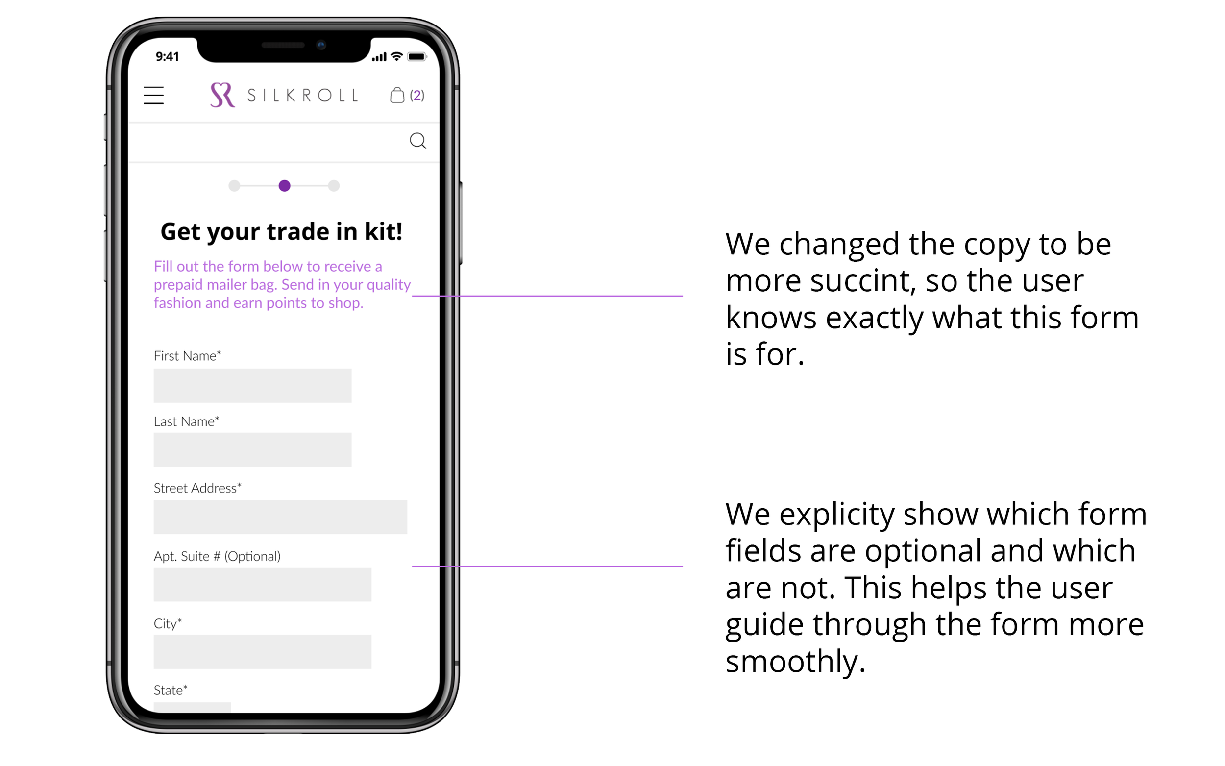
Form design for efficiency

high-fidelity_signupscreen.png

Step 3

Confirm

high-fidelity_screen3.png

Step 4

Customize

high-fidelity_screen4.png
high-fidelity_screen6.png

Results & reflections

In the final round of usability testing, users were able to easily and quickly glide through our sign up process. They felt educated on what items were acceptable to send in to SilkRoll.

SilkRoll was pleased with the design solution. They felt it matched both their business needs and their users’ needs. I delivered annotated high-fidelity wireframes to be implemented by their engineering team.

The solution is now live on SilkRoll.com.

Like what you see? Email me at abreiner24@gmail.com