Redesigning Pandora
Allowing people to discover and customize their listening experience.

Why a Pandora redesign?
Pandora is one of the top 5 music streaming apps on both the App Store and the Google Play store.
The app lacks features that the other top streaming apps provide for their users, making it less of a favorite.
Outdated UI and interaction design.
We love music!

Project overview
Design process:
Research
User interviews, competitive analysis, comparative analysis
Synthesize & ideate
Affinity mapping, design studio
Design & Test
Sketching & paper prototyping, usability testing, A/B testing, low fidelity wireframes, high fidelity wireframes, Interaction design
Tools:
Sketch
InVision
Origami Studio
Adobe Photoshop
Adobe Illustrator
Duration:
4 Weeks
Project Roles:
My colleague and friend, Mattias Rosenberg, and I worked together to gather and synthesize research data. I led the visual design, branding, and UI design in Sketch while Mattias led the interaction design in Origami Studio. We did this design sprint with an Agile structure and participated in rapid iteration, testing and receiving feedback often on our designs.
Although we led different aspects of the project, we provided feedback and ideas to each other at all stages of the process.

My colleague and friend, Mattias, and I.
The problem
“I want to be able to choose what I listen to.”
While Pandora’s radio feature is a great way to discover new music, Pandora currently does not allow users to save songs, make playlists, or customize their listening experience. This is why most users choose Spotify or other streaming apps.
The solution
Allow users to discover, save, and organize music they love.
We proposed that if we create an experience in which users can use Pandora to not only discover new music, but to save and organize the songs they love, then people will be more likely to use Pandora because users want to have control over what they listen to.
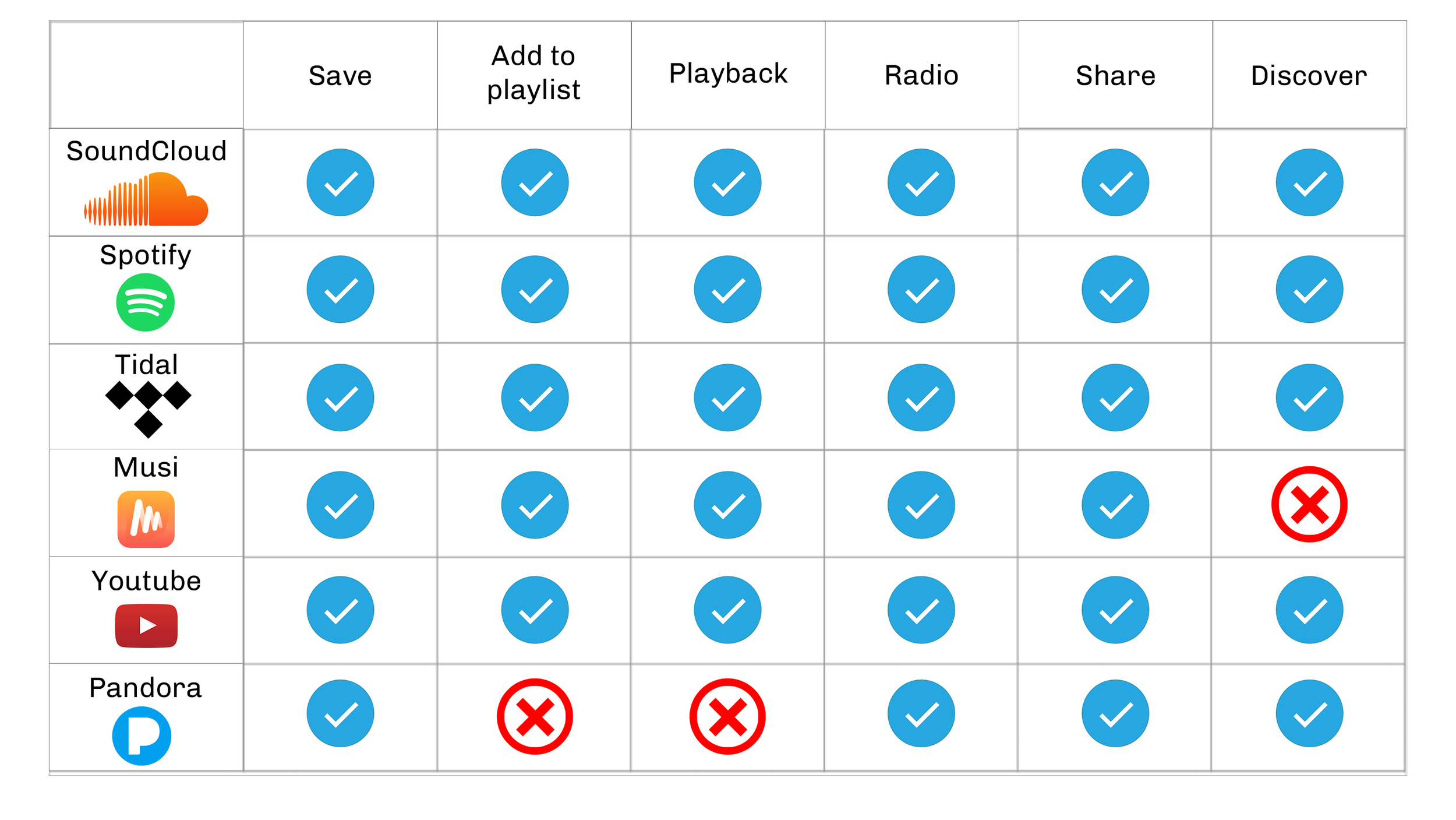
Competitive analysis
Understanding the music streaming marketplace.
We conducted a competitive analysis to figure out where Pandora is lacking compared to other music streaming apps.
We found that the app is lacking in two main categories: the ability to playback a song that a user has enjoyed and a playlist feature, allowing users to save and organize songs for later.
User interviews
Talking to fellow music-lovers
Through our user interviews, we discovered the following key insights:
“I want to be able to choose what I listen to.”
“I want to make my own playlists.”
“I want to discover new music based on music I like.”
“I like being able to access curated playlists to match the mood or occasion.”

Design & test
Rapid iteration to satisfy our users
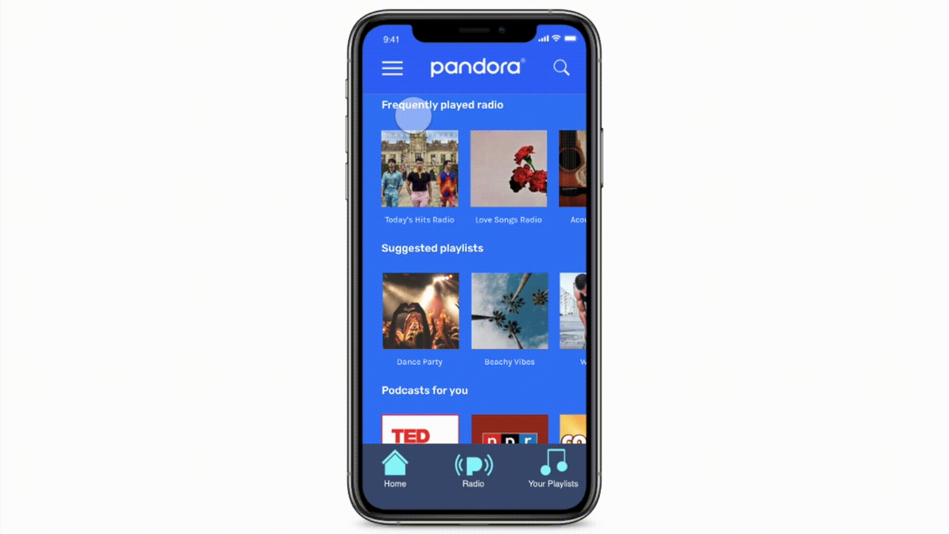
Pandora’s current design

Pandora’s UI and navigation are confusing and outdated. The control buttons are too small for mobile and there are many unnecessary hidden affordances that don’t align with users’ mental models in regards to music streaming apps.
Low fidelity wireframes and usability testing

We started with low fidelity wireframes to use on our rounds of usability testing. We conducted three rounds of usability testing, iterating our wireframes each time according to our users’ needs.
A/B testing

Add to playlist option - users preferred option A. They didn’t understand why the plus icon and the more options icon were both there. Users knew if they clicked the more options icon, it would feature the option to add a song to playlist or save a song.
Confirmation - Users preferred option B because it flowed more seamlessly. Users didn’t want the extra step of pressing a button in option A.
Style & iconography guide
Ensuring consistency between screens

High fidelity design decisions
Easy navigation
Pandora currently does not feature a home screen, making it very difficult for users to navigate through the app and find what they are looking for.

The hamburger menu features account info, saved songs, etc. The users can also search for any song, artist, album, or playlist they want.
Large album covers make it easy to click on the station, podcast, or playlist that the user wants to listen to. Scrolling affordance takes up less space for a cleaner look.
Easy to reach navigation bar where users can access the three main sections of the app.
Upgraded user interface
Interface, in terms of both aesthetic and functionality, can make or break a users’ experience. We updated Pandora’s main radio play screen based on UX heuristics and best practices.


We added the more options icon. Users can access multiple actions here including add to playlist, create radio from song, and share.
Song preview shows a hint of the previous song and the upcoming song, so users can control what they listen to and always go forward or backwards with a simple swipe based on their listening preferences.
We enlarged the key buttons: back, forward and play/pause as well as the thumbs up and thumbs down to make them more user friendly on mobile.
Adding a song to a playlist
We wanted to keep the flow for adding a song to a playlist simple and intuitive, especially since it’s our users’ primary flow. The flow displayed aligns with our users mental models of what adding a song to a playlist should look like.


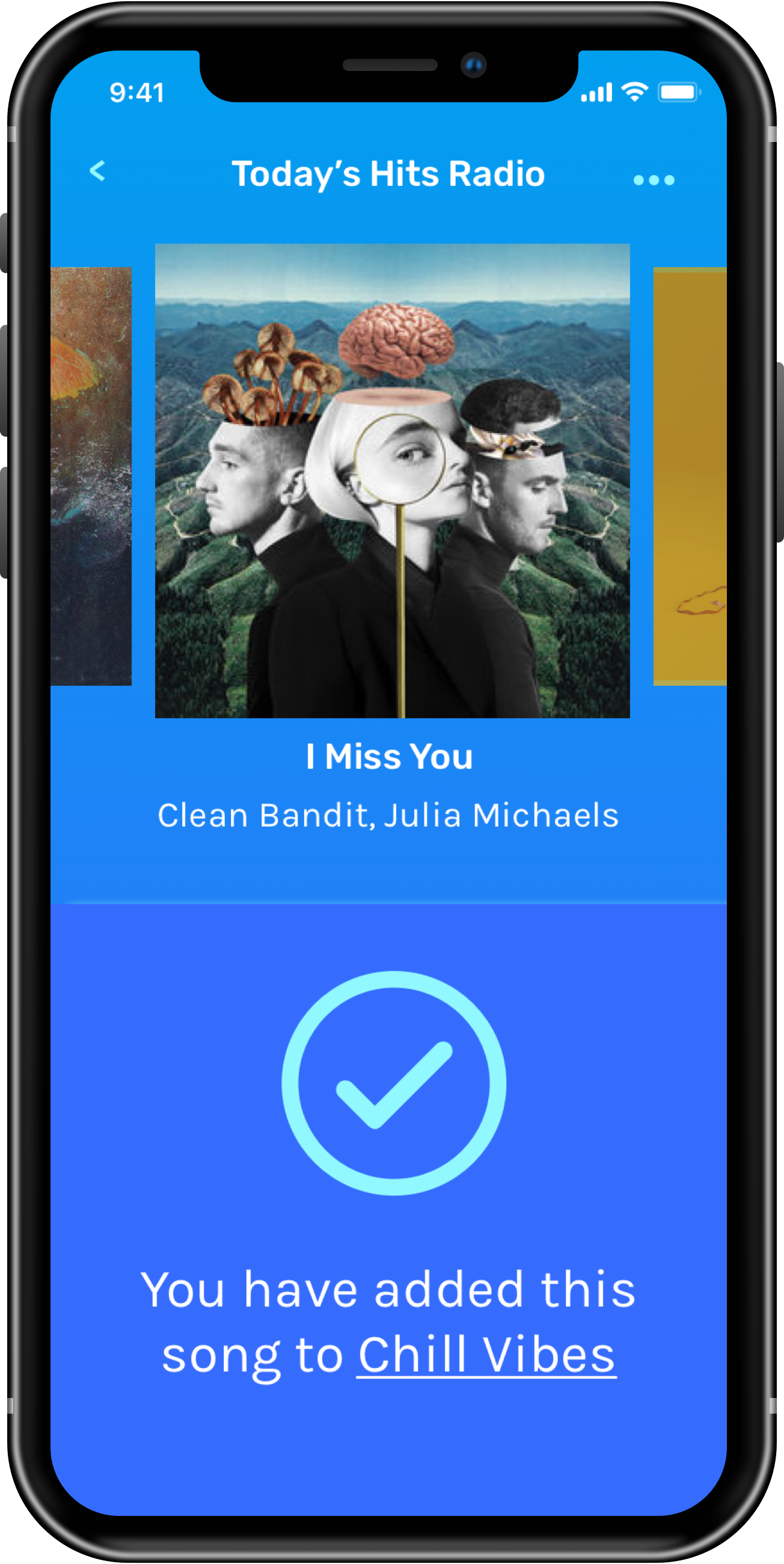

Demonstrating the interactions and flow of adding a song to a playlist.